Making Excel pivot tables is an essential skill for efficiently summarizing, analyzing, and visualizing large datasets in Microsoft Excel. Here’s a comprehensive guide on how to leverage pivot tables effectively:
- Understanding Pivot Tables:
- Pivot tables are a powerful feature in Excel used to summarize and analyze large datasets quickly.
- They allow users to extract meaningful insights from complex data by summarizing it into a more digestible format.
- Pivot tables enable dynamic rearrangement and aggregation of data, making it easy to explore different perspectives and summaries of the dataset.
- Creating a Pivot Table:
- To create a pivot table, follow these steps:
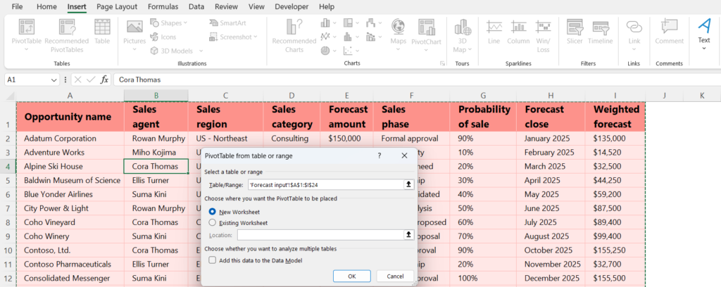
- Select any cell within your dataset.
- Go to the “Insert” tab on the Excel ribbon.
- Click on “PivotTable” and choose the range of data you want to analyze.
- Select where you want to place the pivot table (either in a new worksheet or an existing one) and click “OK”.
- To create a pivot table, follow these steps:
- Designing Pivot Tables:
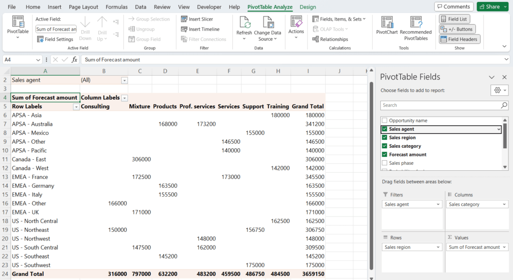
- After creating a pivot table, you can design it by:
- Dragging and dropping fields from the field list into the Rows, Columns, Values, or Filters area.
- Rearranging fields within the pivot table to change the layout and summary.
- Applying filters to focus on specific subsets of data.
- Formatting the pivot table to improve readability.
- After creating a pivot table, you can design it by:
- Analyzing Data with Pivot Tables:
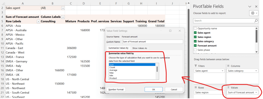
- Pivot tables offer various analytical capabilities, including:
- Summarizing data by sum, count, average, etc.
- Grouping data by date, category, or any other relevant field.
- Calculating percentages and other derived metrics.
- Creating calculated fields to perform custom calculations.
- Pivot tables offer various analytical capabilities, including:
- Visualizing Data with Pivot Tables:
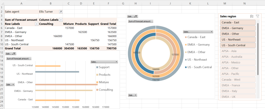
- Pivot tables provide built-in visualization options such as:
- Bar charts, line charts, pie charts, and more, generated automatically from the pivot table data.
- Conditional formatting to highlight important insights or outliers.
- Slicers and timelines for interactive filtering and exploration of data.
- Pivot tables provide built-in visualization options such as:
- Advanced Pivot Table Techniques:
- Advanced users can further enhance their pivot table skills by:
- Using external data sources like SQL databases or OLAP cubes.
- Writing custom calculations using formulas or VBA (Visual Basic for Applications) code.
- Combining multiple data sources into a single pivot table.
- Refreshing pivot table data automatically to reflect updates in the source data.
- Advanced users can further enhance their pivot table skills by:
- Best Practices:
- Keep pivot tables simple and focused on specific analysis objectives.
- Refresh pivot table data regularly, especially if the source data changes frequently.
- Document pivot table configurations and analysis steps for future reference.
- Practice using keyboard shortcuts to streamline pivot table creation and manipulation.
By mastering pivot tables, users can efficiently analyze and visualize large datasets in Excel, uncovering valuable insights and driving informed decision-making. Regular practice and exploration of pivot table features will further enhance proficiency and productivity in data analysis tasks.